In the news deadzone of Christmas week, 84 days after the close of the fiscal quarter, the Permanent Fund Corporation (PFC) finally posted its “Investment Management Fee Report” for the first quarter of Fiscal Year (FY) 2026. The report revealed that the PFC has continued down the same path it has been on for the past three years: high fees for subpar returns.
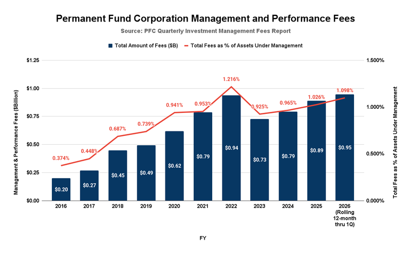
While the report itself covered only the first quarter of FY2026, we can calculate a running 12-month average by adjusting the FY2025 year-end report to replace the first quarter of FY2025 with the first quarter of FY2026. Here is how the running 12-month average as of the end of the first quarter of FY2026 compares to prior periods, going back to the earliest available results on the PFC website (FY2016).

As is clear, the fees are continuing on their recent upward trajectory, both in absolute terms and as a percentage of the total fund balance. The $947 million appears to be a new 12-month high, surpassing the previous high in FY2022. The level of fees, as a percentage of the total fund balance (1.098%), is the second-highest during the period for which PFC reports are available.
That level compares with the .042% experienced by the Government Pension Fund of Norway, as reported in the most recent report of Norges Bank Investment Management, that fund’s manager. Had the PFC operated at the same level, its fees would have been only slightly over $36 million for the period, 96% less than the $947 million the PFC actually paid out.
We say the fees are for “subpar” returns because the PFC’s returns under its “active management” approach remain materially below those reflected in the PFC’s own “Passive Index Benchmark.” According to the PFC, that benchmark reflects:
… a blend of passive indices reflective of a traditional portfolio consisting of public equities, fixed income and real estate investments. Outperformance of the Total Fund versus this Passive Index Benchmark is representative of the value-added by APFC staff in generating higher returns through active asset allocation and portfolio management.
The converse is that underperformance of the Total Fund relative to its Passive Index Benchmark reflects the value subtracted by the PFC’s “active asset allocation and portfolio management.”
The respective performances of the PFC’s Total Fund and Passive Index Benchmark are available in the “Monthly Performance Reports” posted on the PFC’s website. The Passive Index Benchmark was first published in FY2017. The value added or subtracted by the PFC through its current “active asset allocation and portfolio management” can be determined easily by comparing the two.
As the PFC indicates, “outperformance” of the Total Fund versus the Passive Index Benchmark reflects the “value added” through the PFC’s “active asset allocation and portfolio management” approach. Underperformance of the Total Fund relative to the Passive Index Benchmark reflects the value subtracted under that approach.
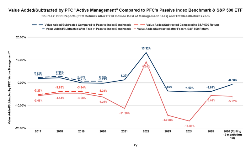
In the following chart, we compare, in blue, the difference between the Total Fund’s performance and the Passive Index Benchmark’s performance over the period for which data are available. The PFC began incorporating management fees into the Total Fund’s returns in FY2021. Before then, the returns stated for the Total Fund are before those costs. A positive number indicates value added by the PFC’s “active asset allocation and portfolio management.” A negative value indicates instances, and the related amount, in which the PFC’s approach subtracted value from the Permanent Fund relative to the Benchmark.
In the following comparisons, the solid lines show the differences among the Total Fund’s performance, the Passive Index Benchmark, and another approach that consistently incorporates management fees into the Total Fund’s stated returns. The dashed lines reflect the PFC’s report on the Total Fund’s performance before it began incorporating management fees into the returns it states for the Total Fund. We determined the Total Fund’s performance after fees for those years by subtracting the stated fees as a percentage of the total fund balance from the return.

Focusing on the blue lines, which compare the Total Fund’s performance against the Passive Index Benchmark, after incorporating management fees, the Total Fund exceeds (“outperforms”) the Passive Index Benchmark in only four of the ten periods. Two of the periods (FY2017 and FY2018) are before the years in which the financial markets were affected by COVID (FY2020 – FY2022). The other two (FY2021 and FY2022) are during the COVID-affected years.
In the other six of the ten periods, the Total Fund has underperformed the PFC’s own Passive Index Benchmark. One of those periods (FY2019) was before, and a second (FY2020) was during the COVID-affected years. The Total Fund has underperformed the PFC’s Passive Index Benchmark in all four periods since the COVID-affected years: FY2023 through FY2026 (Rolling 12-months through 1Q).
On average, the Total Fund, after incorporating management fees, outperformed the Passive Index Benchmark by 1.36% before the COVID-affected years and by 4.80% during the COVID-affected years.
But the PFC’s approach has underperformed the PFC’s Passive Index Benchmark by 3.03% over the four years since the COVID-affected period.
The red lines in the above chart are the result of comparing the returns of the PFC’s Total Fund against those of Vanguard’s S&P 500 Exchange-Traded Fund (ETF), as calculated for the periods using totalrealreturns.com. As we explained in previous columns, as the significant component of Warren Buffett’s 90/10 approach, Vanguard’s S&P 500 ETF is a very low-cost, passive alternative to the PFC’s approach.
The differences between the returns generated by the Total Fund and the Vanguard S&P 500 ETF are even more stark than the differences between the Total Fund and the PFC’s own Passive Index Benchmark.
After incorporating management fees, the Total Fund exceeds (“outperforms”) Vanguard’s S&P 500 ETF in only one (FY2022) of the ten periods. It has underperformed – subtracted value – when compared to Vanguard’s S&P 500 ETF in the other nine of the ten periods.
On average, after incorporating management fees, the PFC’s Total Fund underperformed – subtracted value – when compared to Vanguard’s S&P 500 ETF by 4.93% before the COVID-affected years, by 2.76% during the COVID-affected years, and by a near-staggering 10.66% in the four periods since the COVID-affected years.
Given those results, we believe that there is a fundamental question about whether the PFC’s “active management” approach is, in fact, generating positive value for the Permanent Fund compared to passive alternatives.
Some justify the PFC’s “active” approach and its attendant costs by reference to the PFC’s experience during the 2008 financial crisis, when U.S. stocks experienced a significant bear market. The rationale is that the PFC’s “active” approach maintained stability during that period, whereas a passive approach would have led to substantial losses.
It is somewhat challenging to test the offered justification by comparing the PFC’s “active management” with a more passive approach during that period. The PFC did not start publishing its Passive Index Benchmark until 2017; the Vanguard S&P 500 ETF was not launched until September 2010; and, as we noted previously, the PFC did not start incorporating the management fees into its Total Return until FY2021, or even reporting them until FY2016.
With some caveats, however, we make a stab at such a comparison in the following three charts.
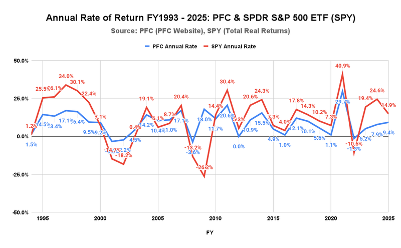
The first shows the annual rate of return by year, reported by two sources: the PFC (blue line) and the State Street Investment Management Company’s Standard & Poor’s Depositary Receipts (SPDR) S&P 500 ETF Trust (NYSEARCA: SPY) (red). We use SPY as the proxy for the S&P 500 ETF alternative because it is the oldest and thus has the most extensive history of the S&P 500 ETFs.
As a caveat, we note that, before FY2021, the returns for the PFC option are not net of the management fees incurred in generating them. Because one of the significant advantages of an S&P 500 ETF is its much lower costs, the failure to account for fees tends to make the PFC option appear to have higher relative returns than it would if the two options were compared on an apples-to-apples basis.

As is clear, the returns generated by the S&P 500 ETF over the 30 years the chart covers had significantly higher annual highs but also considerably lower lows than those achieved by the PFC. Advocates of the PFC approach focus on the S&P 500 ETF’s lows, particularly the drops during the Dot-Com burst of the early 2000s and the 2008 fiscal crisis. They tend, however, to overlook the significant highs achieved by the S&P 500 ETF before and after those periods.
Moreover, they tend to overlook that, since the end of the 2008 fiscal crisis, the S&P 500 ETF has outperformed the PFC in every year over the subsequent 15 years from FY2010 to the present, except for one year: the COVID-affected FY2022.
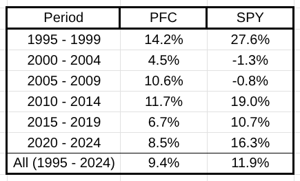
To put both in context, here are the 5-year average returns under the two approaches over the 30 years. When reviewing, keep in mind that the PFC did not include the management fees it paid in its return calculation until FY2021. Thus, its results are overstated by an indeterminate amount before that time relative to the S&P 500 ETF.

As is clear, while the S&P 500 ETF lagged behind the PFC’s “active management” approach in the early 2000s, the lag was not as significant as some suggest and was more than offset by the S&P 500 ETF’s performance during the remainder of the period.
As an additional measure, we have developed a third chart that traces the rolling 5-year average of the Gross Value (before contributions and distributions) of $1 billion invested in 1993 at the annual rate of return, compounded annually, under two scenarios: invested in the manner followed by the PFC over the period (the blue line), and invested in the SPDR S&P 500 ETF Trust (SPY) over the period (red).
We use rolling 5-year averages because they are the basis for the Legislature’s Percent-of-Market-Value (POMV) draws from the Permanent Fund. Among other reasons, the POMV is based on rolling 5-year averages because the approach helps smooth the variability that otherwise appears in year-to-year results. Using the rolling 5-year averages in the chart helps present the data in a way that reflects how the Legislature and others currently view the Permanent Fund balances.
Because this discussion focuses on the use of a passive investment tool, and to avoid the chart becoming too busy, we include only the rolling 5-year averages for the SPY proxy. The PFC option balances are relatively easy to determine by reference.

As a caveat, we note again that, before FY2021, the balances for the PFC option were not adjusted to reflect the management fees incurred in generating them. Because one of the advantages of an S&P 500 ETF is its much lower costs, the failure to account for fees tends to make the PFC option appear to yield higher returns than it would on an apples-to-apples basis.
Consistent with the previous charts, this chart shows that while the S&P 500 ETF lagged the PFC’s approach for a period as a result of the Dot-Com and financial crisis events of the early 2000’s, the rolling 5-year average of the S&P 500 ETF balances has significantly outperformed the PFC’s approach during the other periods, particularly during the period since 2019. Because the chart is built using rolling 5-year averages, the effects of any particular event are somewhat delayed and softened. For example, despite the negative returns experienced during the height of the Dot-Com and financial crises, the rolling 5-year average balances remained essentially unchanged throughout the cycle. The precipitous decline, some claim, didn’t occur.
For the same reason, the S&P 500 ETF’s outperformance relative to the PFC’s approach since 2009 is expected to continue to drive superior returns, as measured by rolling 5-year averages, well into the future.
To some degree, those advocates of the PFC’s current approach who focus on relative performance in the early 2000s remind us of those who supported building the French Maginot Line between World Wars 1 and 2. The Maginot Line was a very costly effort designed to defend France against the type of German attacks that were common during World War 1, but proved utterly useless against the kind of attacks that occurred in World War 2. The experience is often cited as a prime example of the costs of relying on a strategy to fight the “last war” rather than modifying the plan as the underlying situation evolves.
The PFC’s use of its costly “active management” approach may have helped moderate somewhat the effects of the Dot-Com and financial crises of the early 2000s, but has since proven inadequate at matching the superior returns generated by the Buffett 90/10 and other low-cost passive approaches in the current era. Similar to the Maginot Line, the PFC’s strategy seems geared to fighting the “last war” rather than to position the Permanent Fund to capitalize on the significant upside offered by the substantially lower-cost Buffett 90/10 and other similar ETF approaches developed since.
Brad Keithley is the Managing Director of Alaskans for Sustainable Budgets, a project focused on developing and advocating for economically robust and durable state fiscal policies. You can follow the work of the project on its website, at @AK4SB on Twitter, on its Facebook page or by subscribing to its weekly podcast on Substack.


Yikes!
Why are alarm bells not sounding Governor a Dunleavy??
“Governor a Dunleavy”? C’mon Geldy, I thought you attorneys paid better attention to your grammar and spelling than the average Joe!